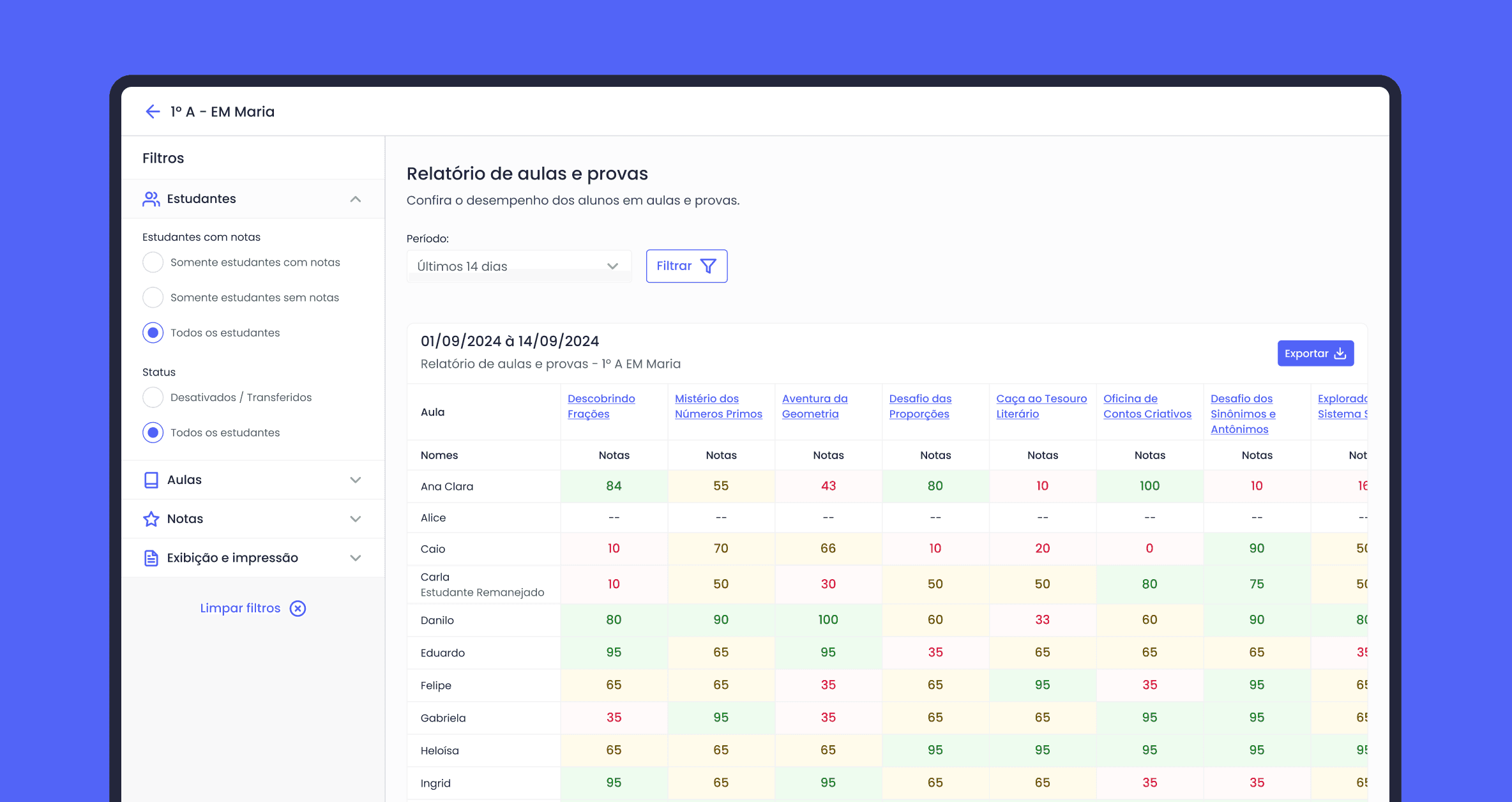
Improving the Pix transfer experience
Period
2023
Company
Superdigital · Outsourced
My role
Product Designer
Squad
Payments & Transactions
Introduction
Project context
I worked at Superdigital, a payment institution belonging to the Santander group that operates in Brazil and other Latin American countries. The Pix transfer flow was designed in 2020 to meet the launch requirements regulated by the Central Bank. However, the lack of updates since then generated numerous complaints across various company channels.
Defined goals
Project challenges
Research and discoveries
Analyzing user reviews
To start the discovery, I used the available review channels (Reclame Aqui, Play Store, and App Store) to collect user feedback on the Pix user experience. Here are some of the main feedbacks analyzed:
“You can't even send a Pix receipt, you have to take a screenshot. Making a Pix is horrible and complicated, it's really not worth it, without a doubt this app was not made by professionals”
"I have been using the app frequently. However, I miss a few things. The main one is the option to save Pix key contacts..."
"...Pix, which is supposed to be something simple and practical, is a struggle. I have to redo transactions more than 5 times, because it shows as completed but doesn't send the money. There was one case where I ended up spending 24 hours without knowing where my money was, so disappointed. If I could, I would stop using it."
"Regrettable, what was supposed to be simple and fast like Pix, ends up becoming a horrible experience in a digital account. I only managed to make a simple transfer after 7 frustrated attempts, this is disappointing."
"I don't get notifications for received pix, I have to keep opening the app every time I receive a pix. For those of us who run a business, this makes things very slow..."
“Good app, but I don't receive pix notifications and you have to specify the type of pix key, whereas other bank apps recognize the key type automatically.”
Key insights obtained:
Users miss the ability to save and manage keys for Pix transactions.
Users would like to be notified about sent and received transactions.
Users find the flow more complicated than at other financial institutions.
The inability to send the Pix payment receipt annoys users.
Observing the positioning of other institutions
I examined the Pix transfer process from other institutions to get a clearer understanding of the experiences available in the market.
We learned that some institutions:
They provide features that bring agility to the process of transferring and managing keys.
They focus on the value to be sent and the payment recipient.
They have the minimum number of screens and interactions necessary to complete the payment.
Transforming observations into quantitative data
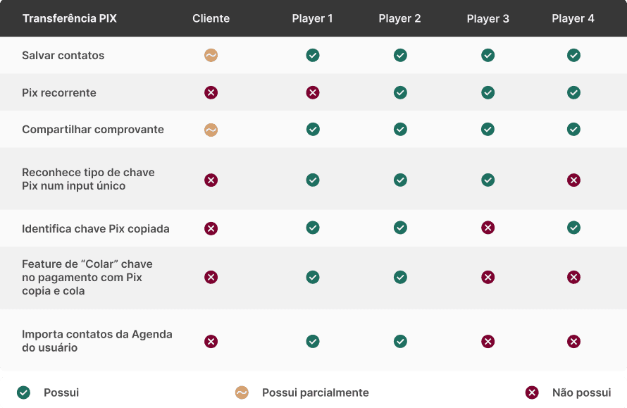
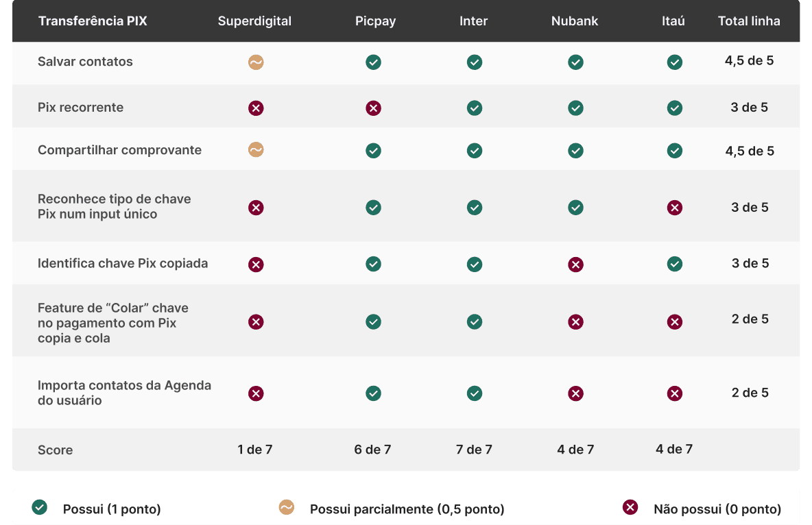
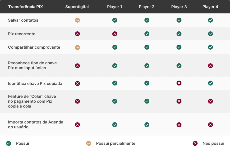
I tabulated the data from previous research to create a table showing the features of each player. These features, although not mandatory according to the Central Bank's regulations, guided me to think of ways to assist users in their goals.
Evaluating the legacy journey based on Nielsen's Heuristics
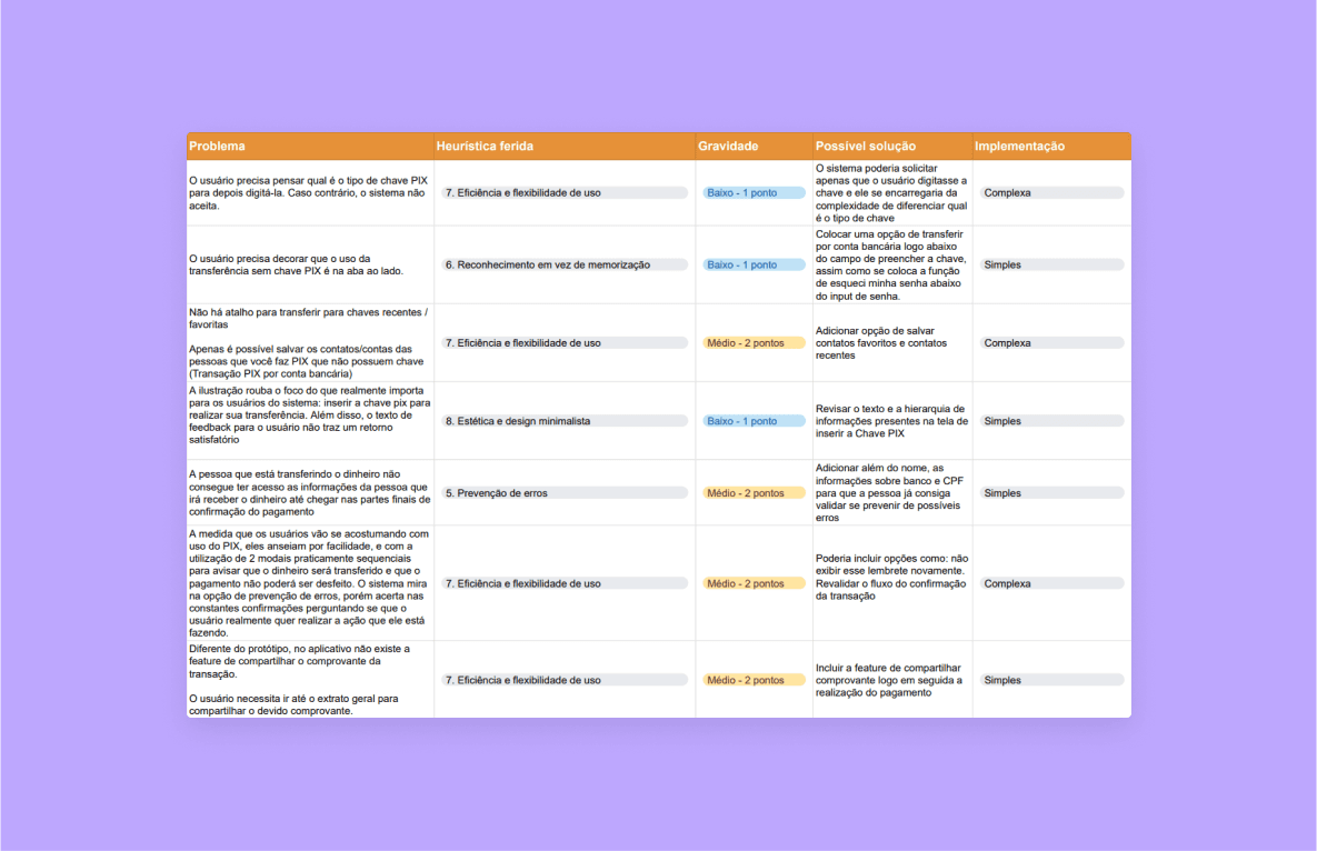
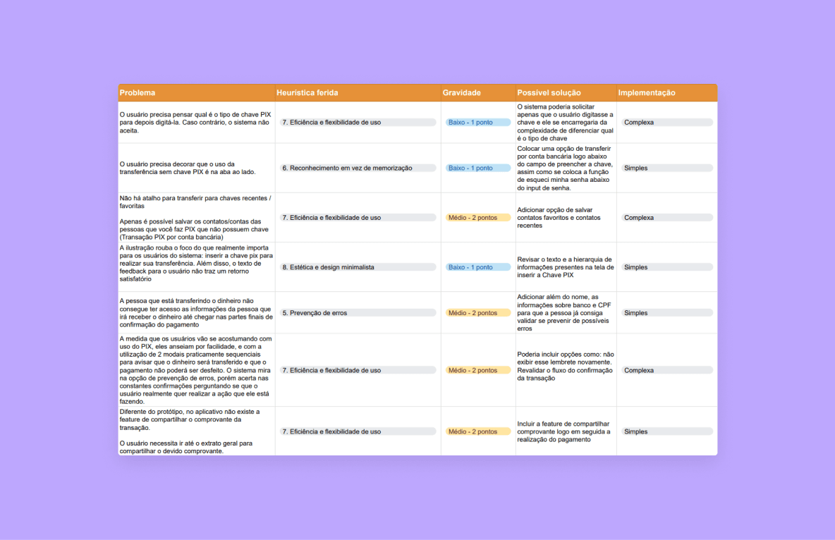
I conducted a heuristic evaluation to identify, classify, and propose solutions for usability issues. I tabulated the results in a spreadsheet and generated charts to map the violated heuristics, severity levels, and implementation difficulty of the proposed solutions.
Key opportunities and findings
Defining the scope
Prioritizing features
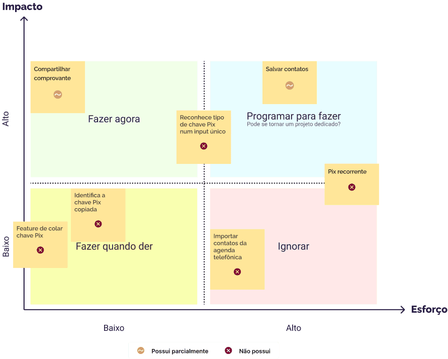
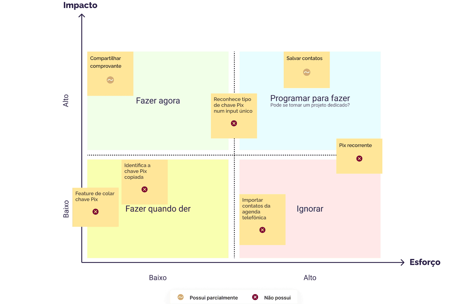
I applied an effort versus impact matrix to define which items should be prioritized. In addition, for a more accurate estimation of the required effort, we took into account whether or not the client already had the feature.
Throughout the project, I kept the prioritized items in focus, developing solutions for the functionalities with the greatest impact and least effort, and started dedicated projects with the team to develop those that would require more effort due to their complexity.
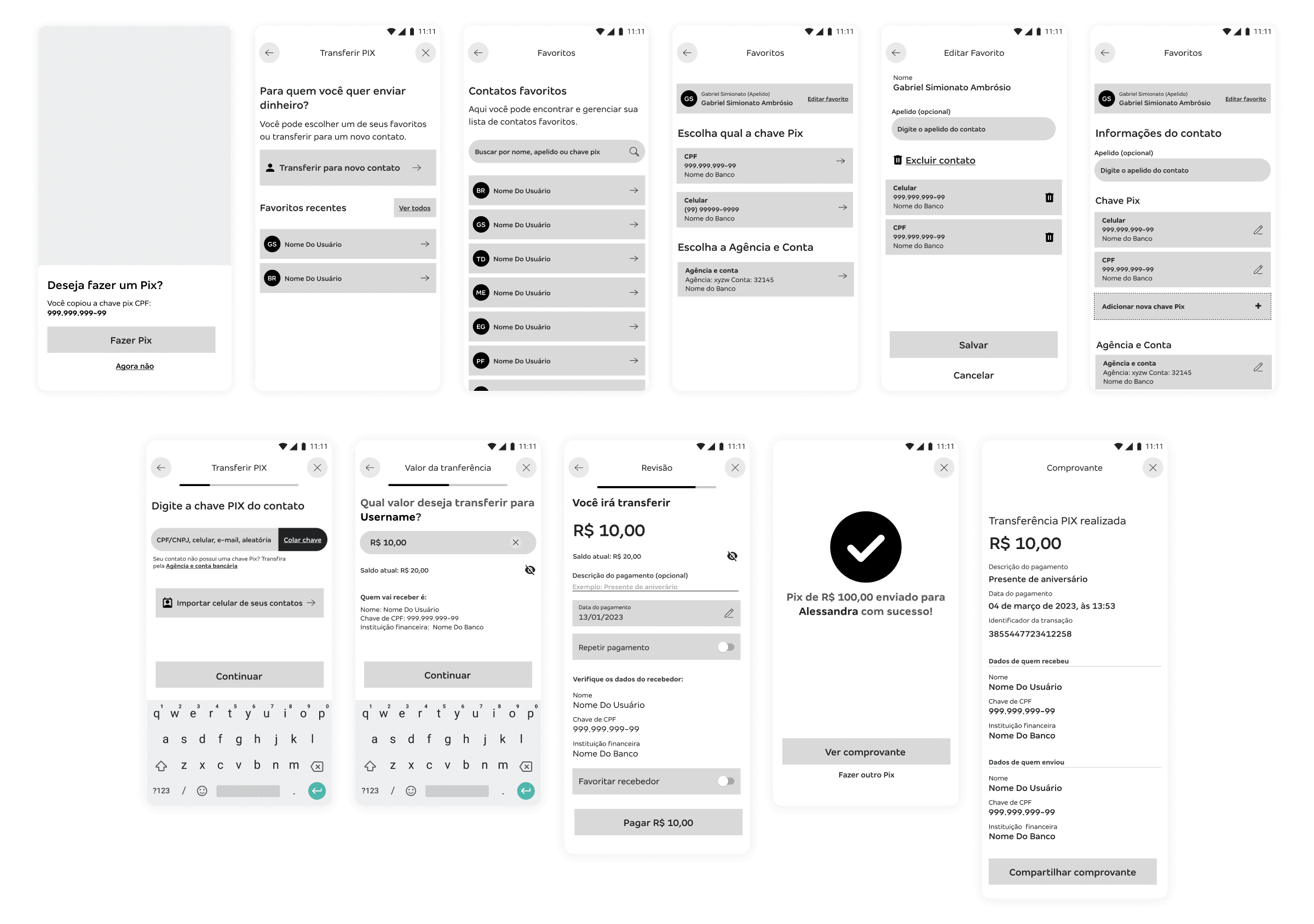
Drafting solutions
Bypassing obstacles
In the middle of the road there was a stone…
The proposed solutions
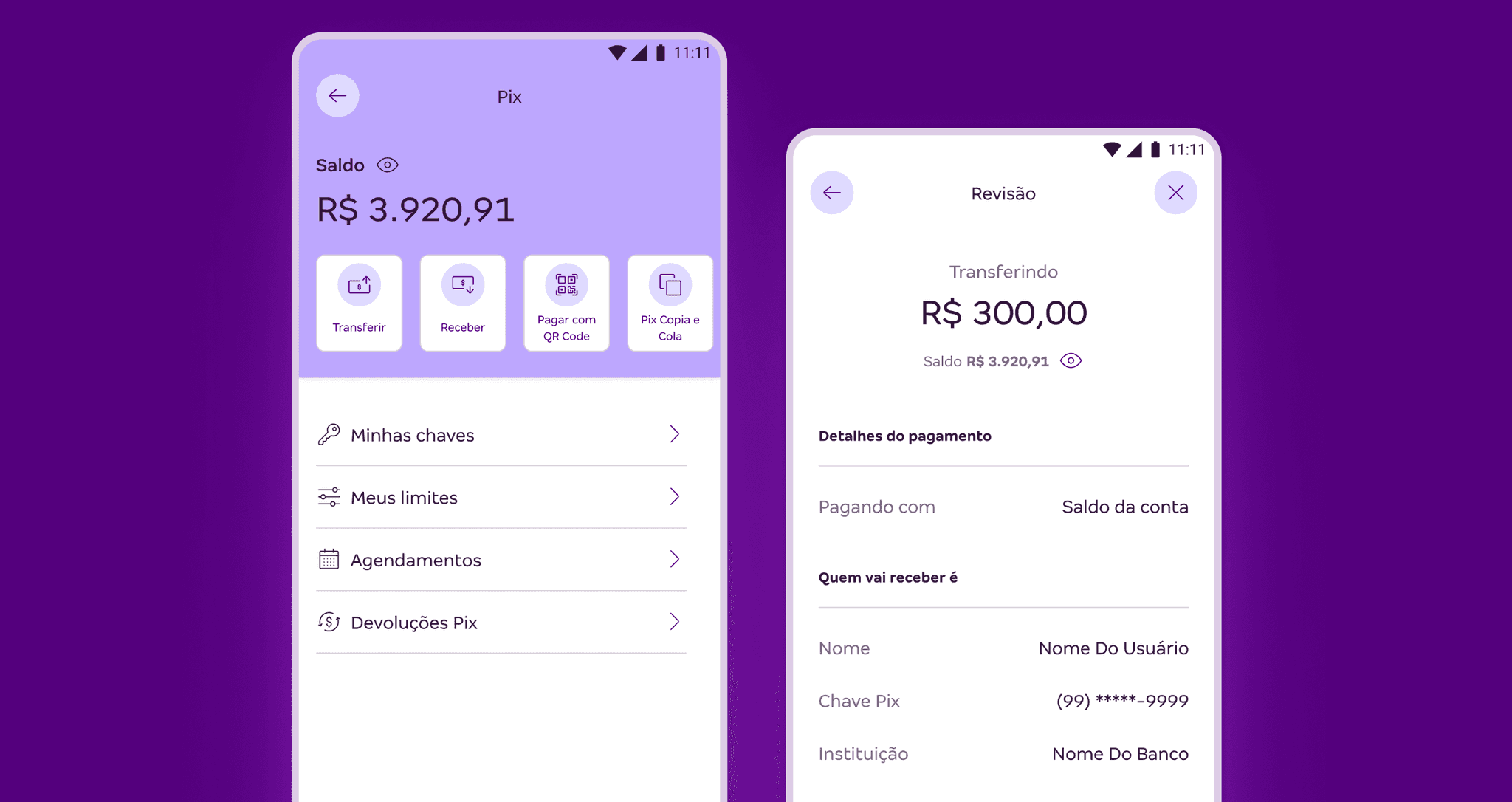
New Pix area
I used horizontal shortcuts for the most frequently used actions, and a vertical list for the management features.
Before
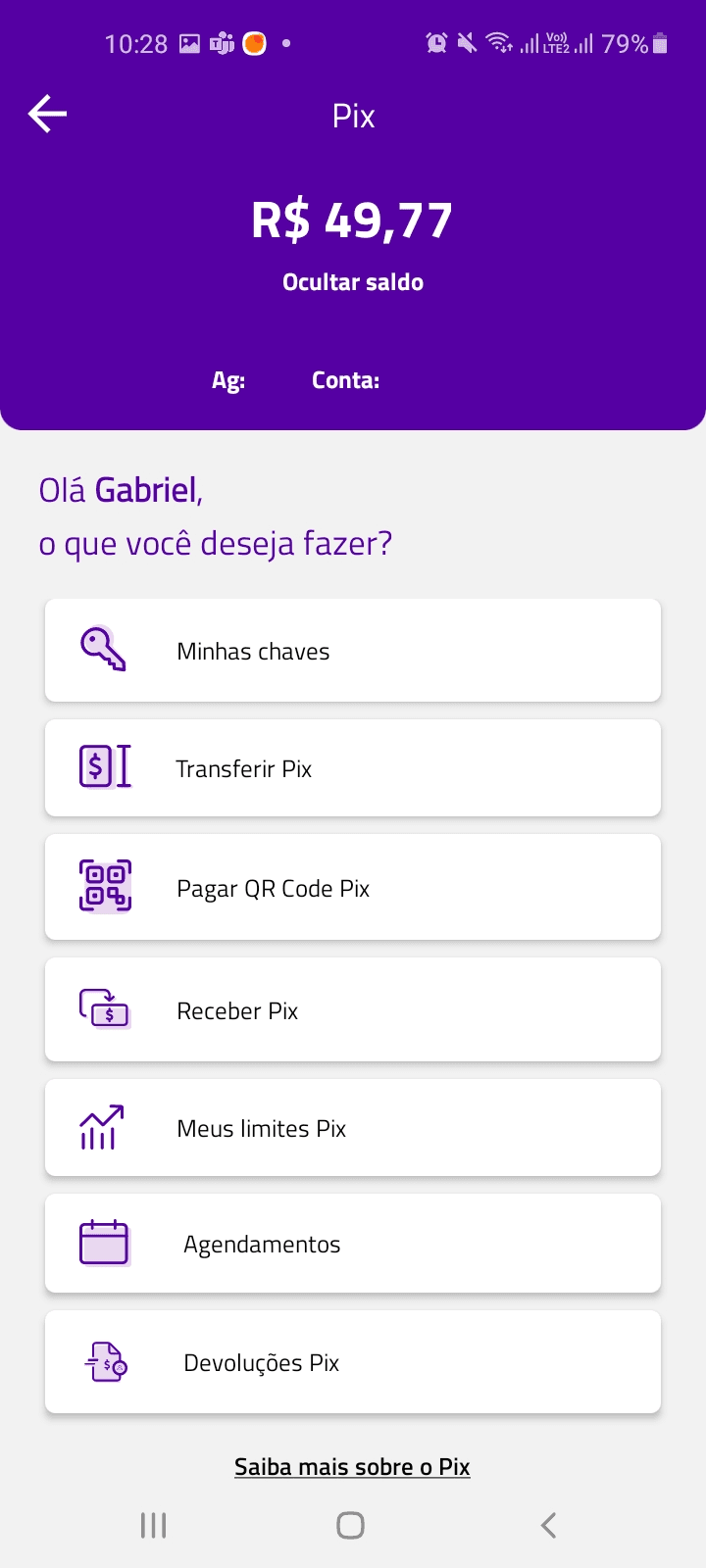
Later
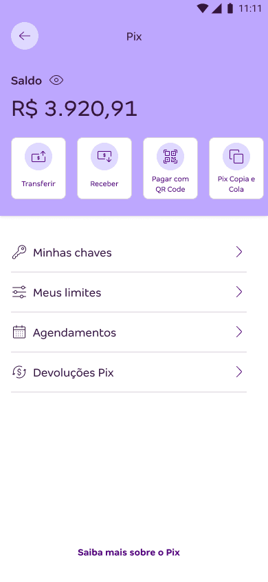
Transfer home screen
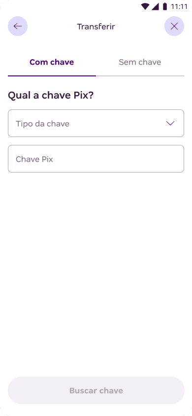
Greater focus on the interface's input and data submission elements.
Before
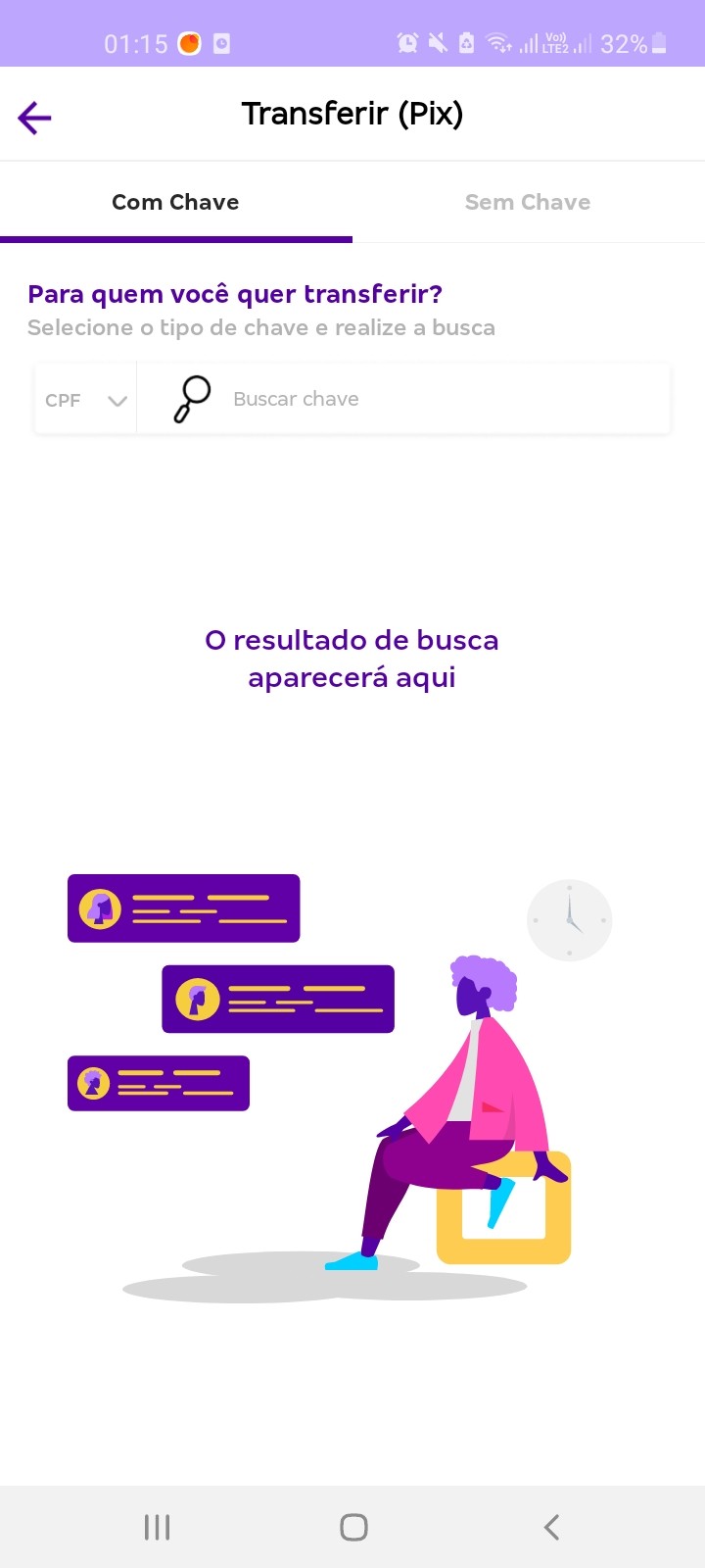
Later
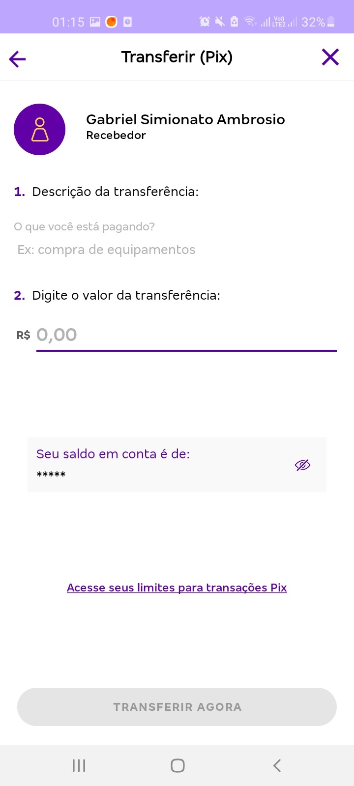
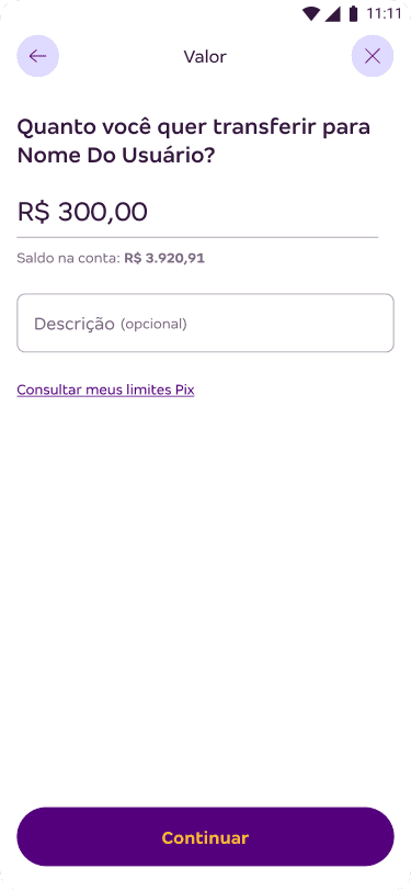
Fill in the payment amount
The value input field now occupies a higher hierarchy in the interface, and I have made it clear that the description is optional.
Additionally, the recipient's name is highlighted in the instructional text of the interface.
Before
Later
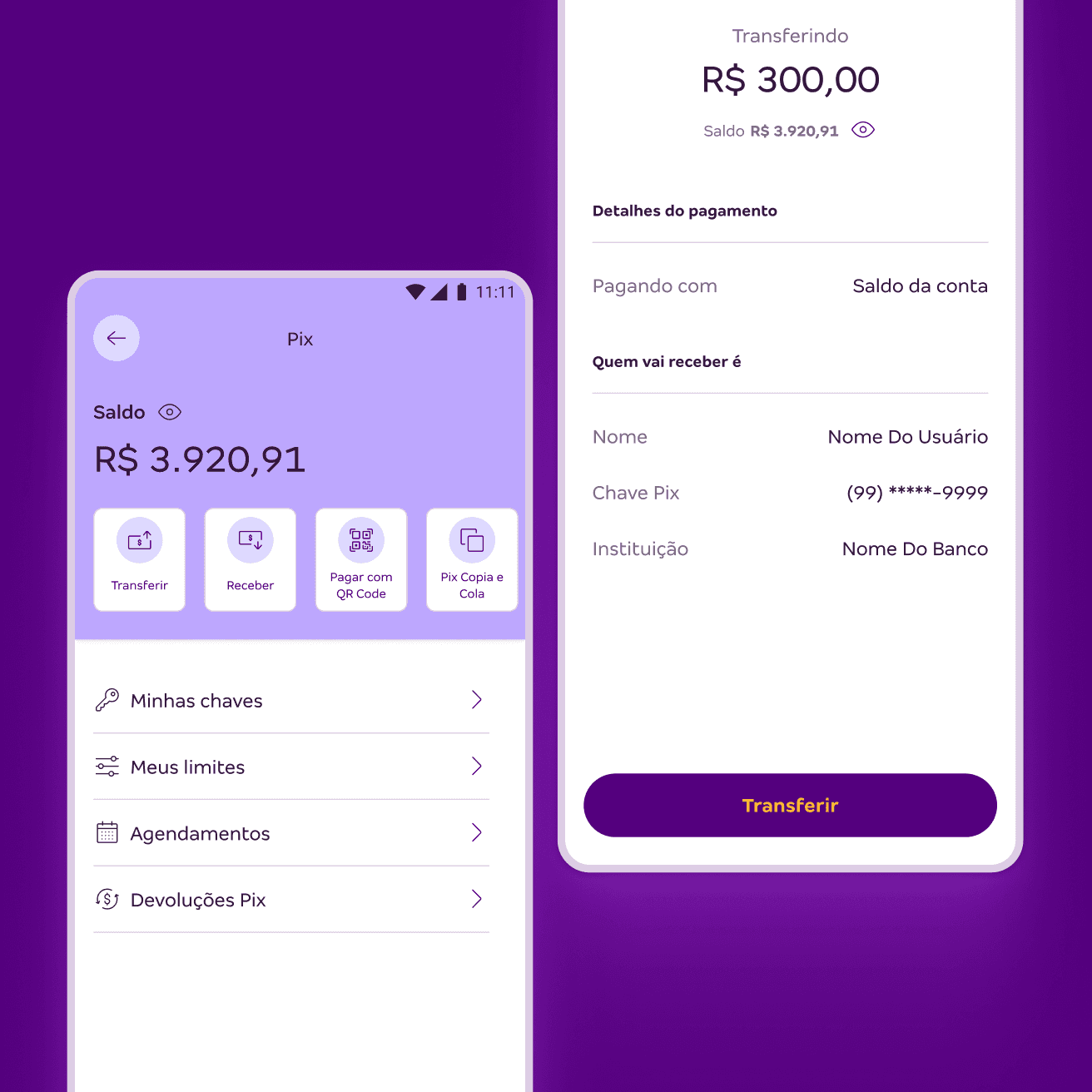
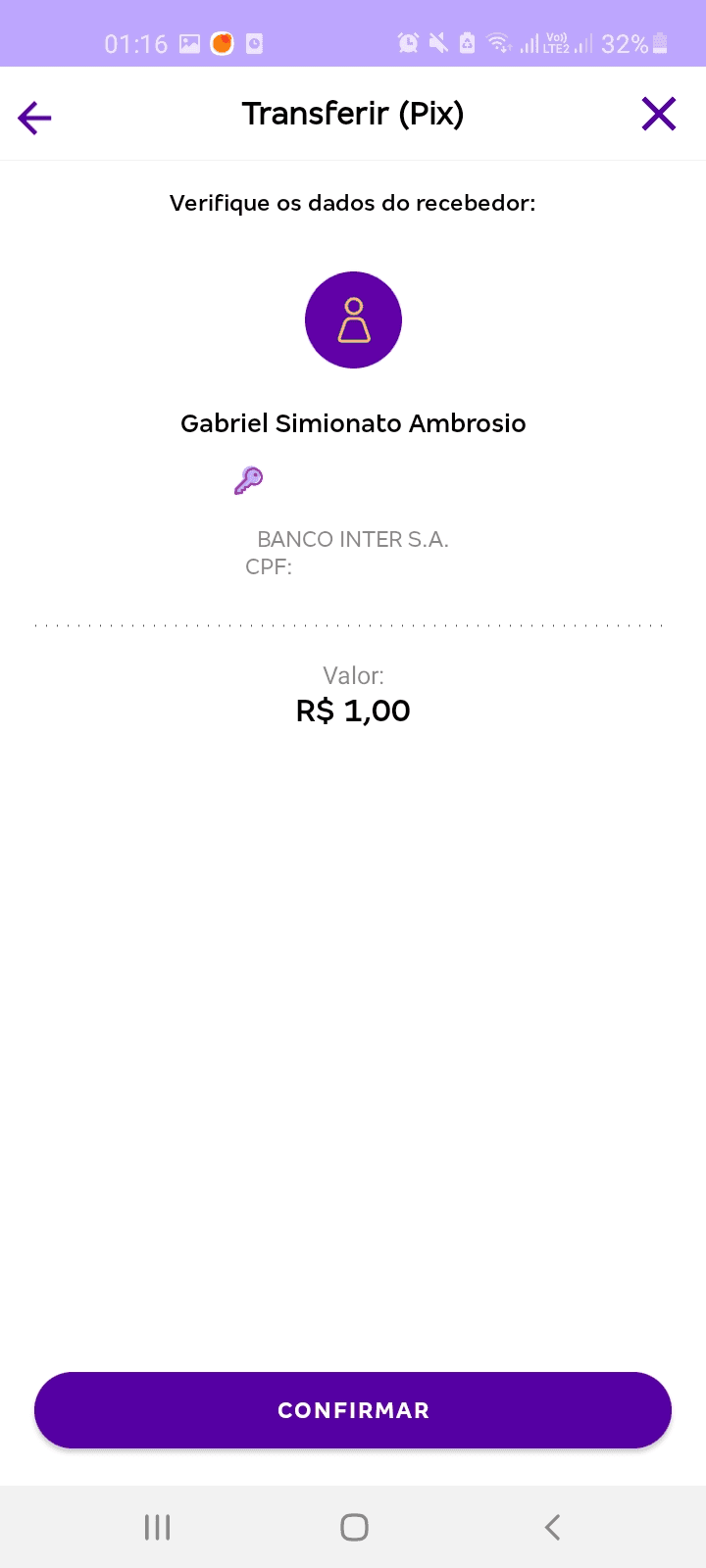
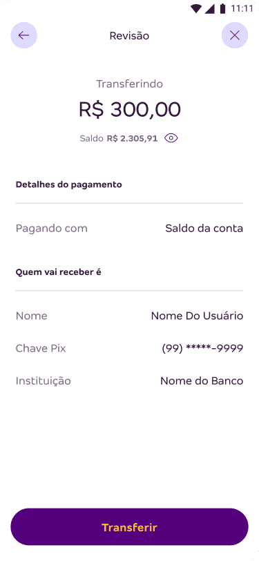
Confirm transaction
The transfer value now occupies the prominent position, along with feedback on the account balance right below it.
The display of payment and recipient information has been reorganized into a list.
Before
Later
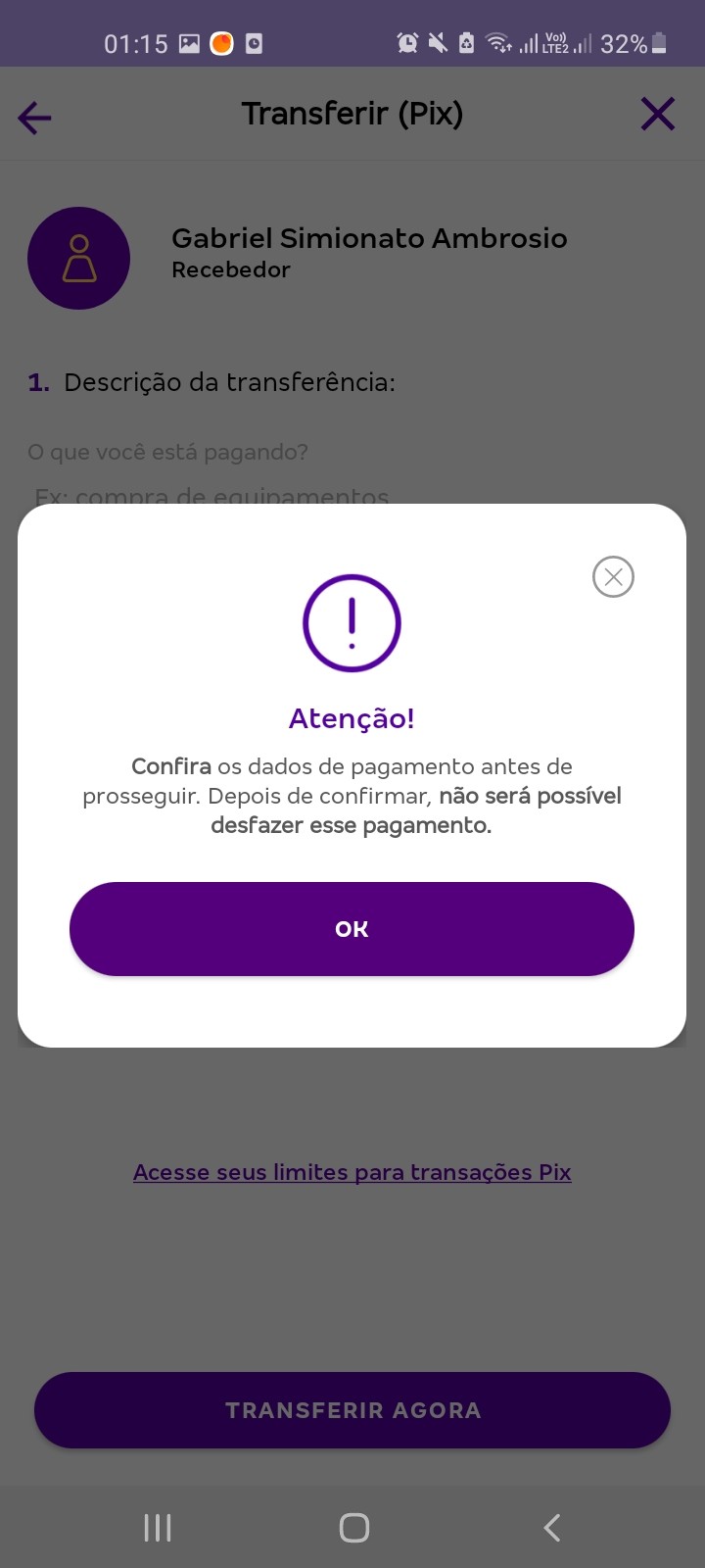
Removing friction in the journey
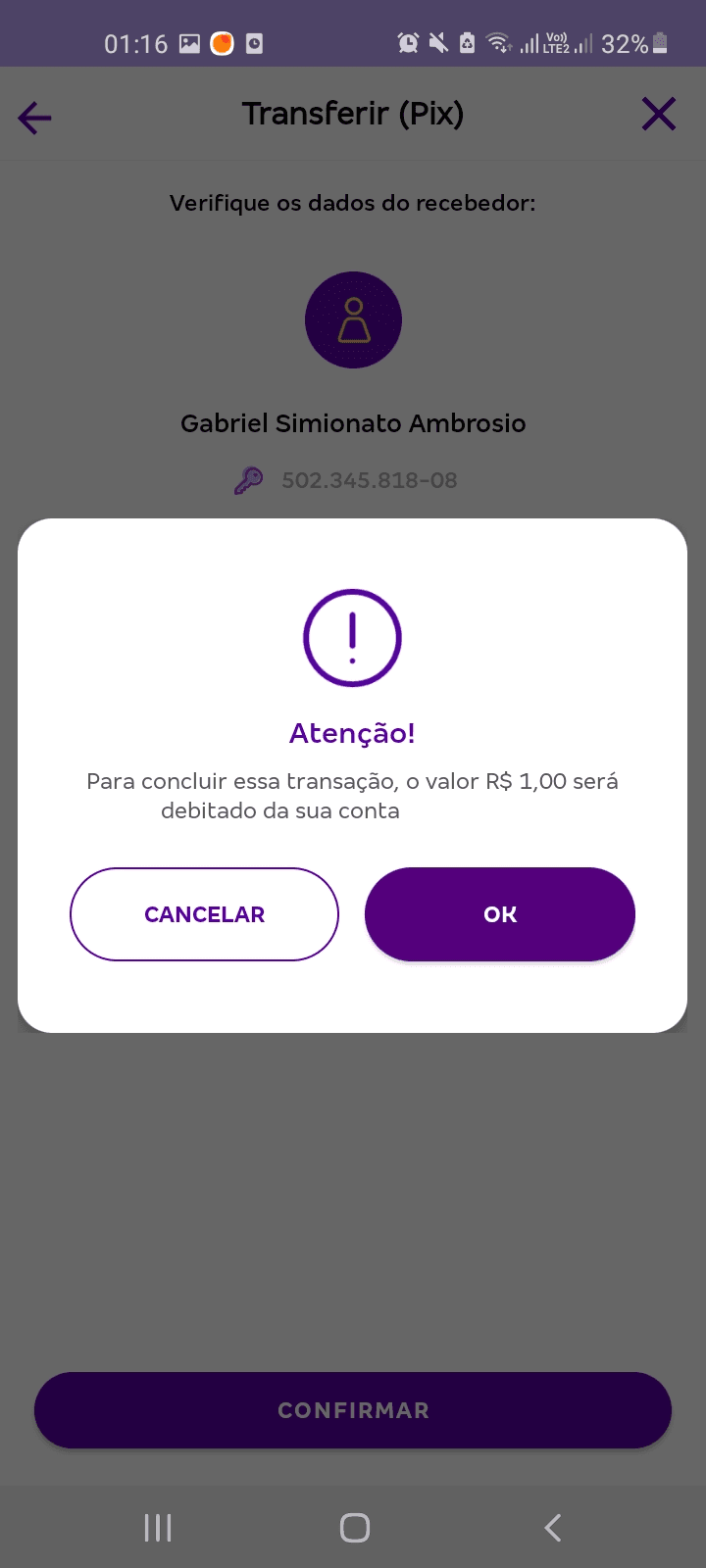
The legacy flow was created for the launch of Pix, amid uncertainty about its operation and user reactions. With the popularization of this payment method, it was possible to eliminate the modals that caused undesirable friction in the experience by requesting excessive confirmations.
Before
New transfer receipt
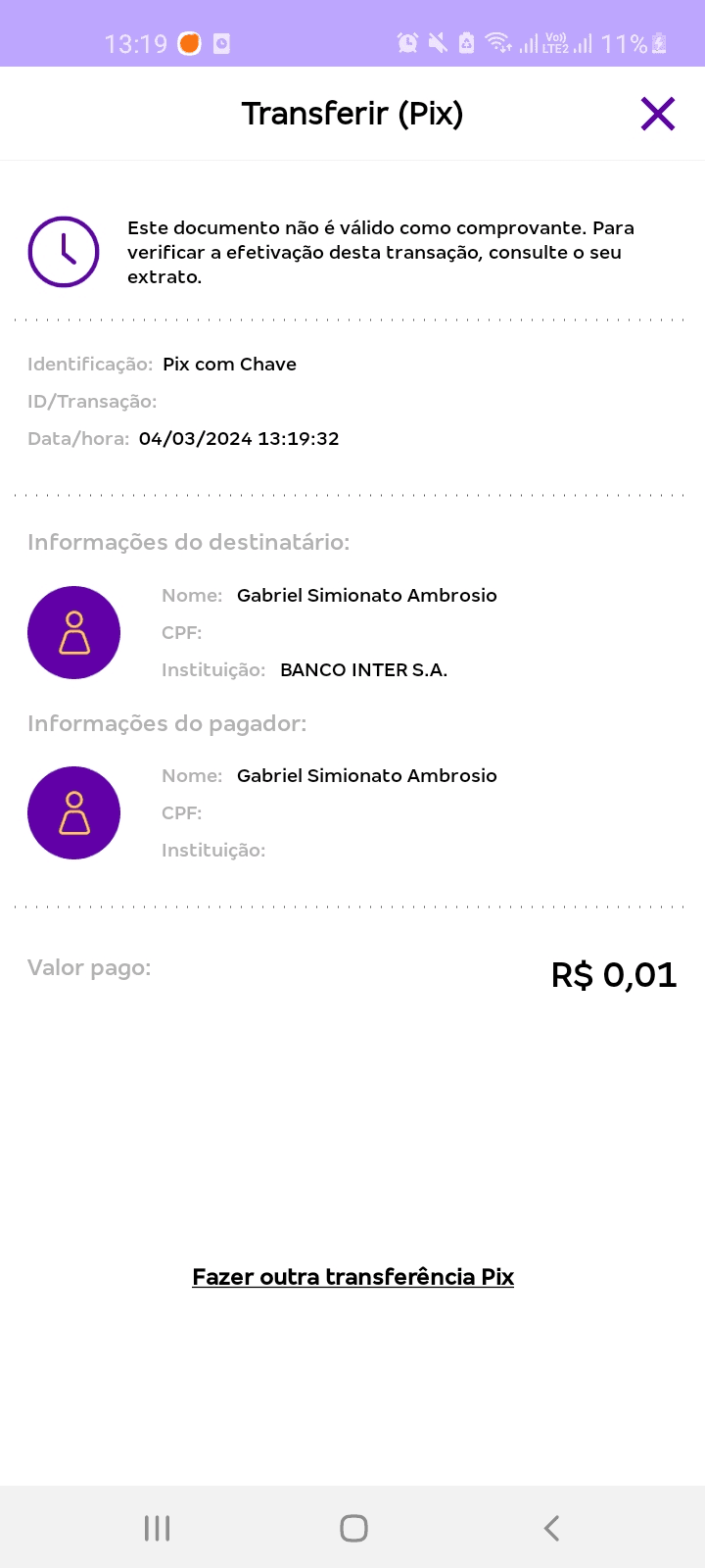
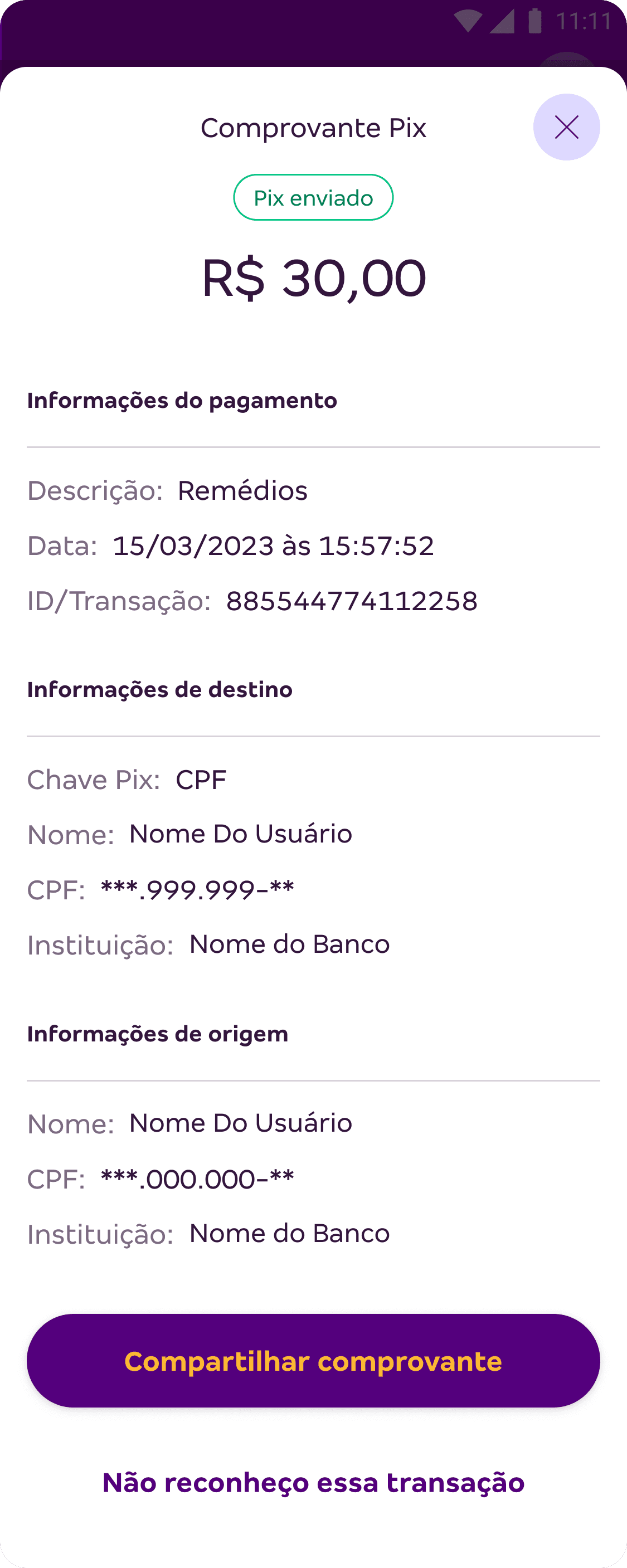
It is now possible to share the receipt immediately after the transaction.
In addition to prioritizing a clear and objective view of the payment information.
Before
Later
Communicating with our users
Now there are push notifications to asynchronously inform users about sending and receiving Pix transactions.
Later

Defining success indicators
We did not have a dedicated Analytics team to monitor the performance of the proposed changes. Even so, I defined with the squad the indicators that should be observed as signs of success over time:
Improvement in user satisfaction with the journey, reflected in reviews and qualitative feedback.
Compliance with all regulations defined in the Central Bank manual.
Key takeaways
What did I learn during this project?
The impact of a Design System
Using it brought agility and consistent deliveries, allowing us to focus on user needs. Creating the final design becomes similar to assembling Lego bricks.
Adapting communication is essential
Qualitative information is invaluable, but adapting it quantitatively can be more effective for demonstrating results objectively.