Improving the experience of transferring via Pix

Time

2023

Company

Superdigital · Outsourced

My role

Product Designer

Squad

Payments & Transactions

Introduction

Project context

I worked at Superdigital, a payment institution from the Santander group operating in Brazil and other Latin American countries. The transfer flow via Pix was designed in 2020 to meet launch requirements regulated by the Central Bank. However, the lack of updates since then generated numerous complaints across various company channels.

Defined objectives

Map user pain points through a Product Discovery.

Map user pain points through a Product Discovery.

Implement the Design System to unify design patterns.

Implement the Design System to unify design patterns.

Implement the Design System to unify design patterns.

Create improvement proposals for the flow based on findings.

Create improvement proposals for the flow based on findings.

Create improvement proposals for the flow based on findings.

Project challenges

Discovery without having direct contact with users.

Discovery without having direct contact with users.

Migrate the journey to the new Design System.

Migrate the journey to the new Design System.

Meet BACEN requirements and schedule.

Meet BACEN requirements and schedule.

Research and discoveries

Investigating friction points in the journey

To understand the bottlenecks in the Pix experience and Superdigital’s market positioning, I structured the discovery phase by combining active user listening, quantitative benchmarking, and a heuristic evaluation of the legacy journey.

Analysis of user reviews

I mapped key user pain points and desires regarding the Pix flow based on feedback from Reclame Aqui, the Play Store, and the App Store.

Market benchmarking

I examined the Pix transfer process at competing institutions to identify patterns and industry best practices.

Quantitative feature matrix

I tabulated features offered by market players to prioritize opportunities for differentiation and agility.

Heuristic evaluation of the legacy journey

I audited the flow against Nielsen’s Heuristics, mapping usability issues by severity level and effort to resolve them.

Key opportunities and findings
Lack of basic efficiency features

The inability to save frequently used keys and the lack of a direct option to send payment receipts caused constant dissatisfaction.

Lack of basic efficiency features

The inability to save frequently used keys and the lack of a direct option to send payment receipts caused constant dissatisfaction.

Lack of real-time notifications

Without alerts for incoming or outgoing payments, users had to repeatedly open the app to check the status.

Lack of real-time notifications

Without alerts for incoming or outgoing payments, users had to repeatedly open the app to check the status.

Cumbersome workflow and excessive confirmations

The process involved unnecessary screens and steps, making transfers slower compared to other banks.

Cumbersome workflow and excessive confirmations

The process involved unnecessary screens and steps, making transfers slower compared to other banks.

Data clarity and hierarchy during review

The confirmation screen did not highlight recipient details clearly enough to instill confidence before sending the payment.

Data clarity and hierarchy during review

The confirmation screen did not highlight recipient details clearly enough to instill confidence before sending the payment.

UI and UX writing inconsistencies

Unclear messaging and a lack of visual standardization increased the cognitive load during transactions.

UI and UX writing inconsistencies

Unclear messaging and a lack of visual standardization increased the cognitive load during transactions.

Defining the scope

Prioritizing features
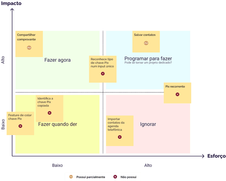
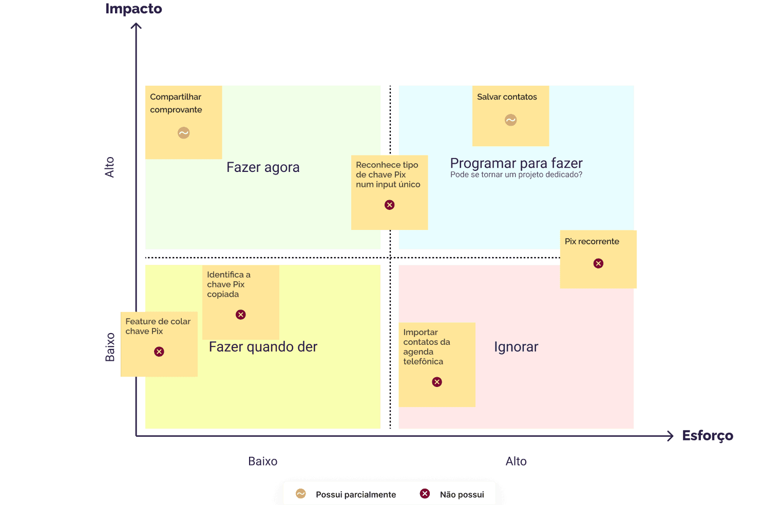
I applied an effort-versus-impact matrix to determine which items to prioritize. Additionally, to estimate the required effort more accurately, we considered whether the client already possessed the feature in question.

Throughout the project, I kept the prioritized items in focus, devising solutions for features with high impact and low effort, while launching dedicated projects with the team to develop those requiring greater effort due to their complexity.

Apliquei uma matriz de esforço versus impacto para definir quais itens deveriam ser priorizados. Além disso, para uma estimativa mais precisa do esforço necessário, levamos em conta se o cliente já possuía ou não a funcionalidade.

Durante todo o projeto, mantive os itens priorizados em foco, elaborando soluções para as funcionalidades com maior impacto e menor esforço, e iniciei projetos dedicados com o time para desenvolver as que exigiriam maior esforço devido à sua complexidade.

Sketching solutions

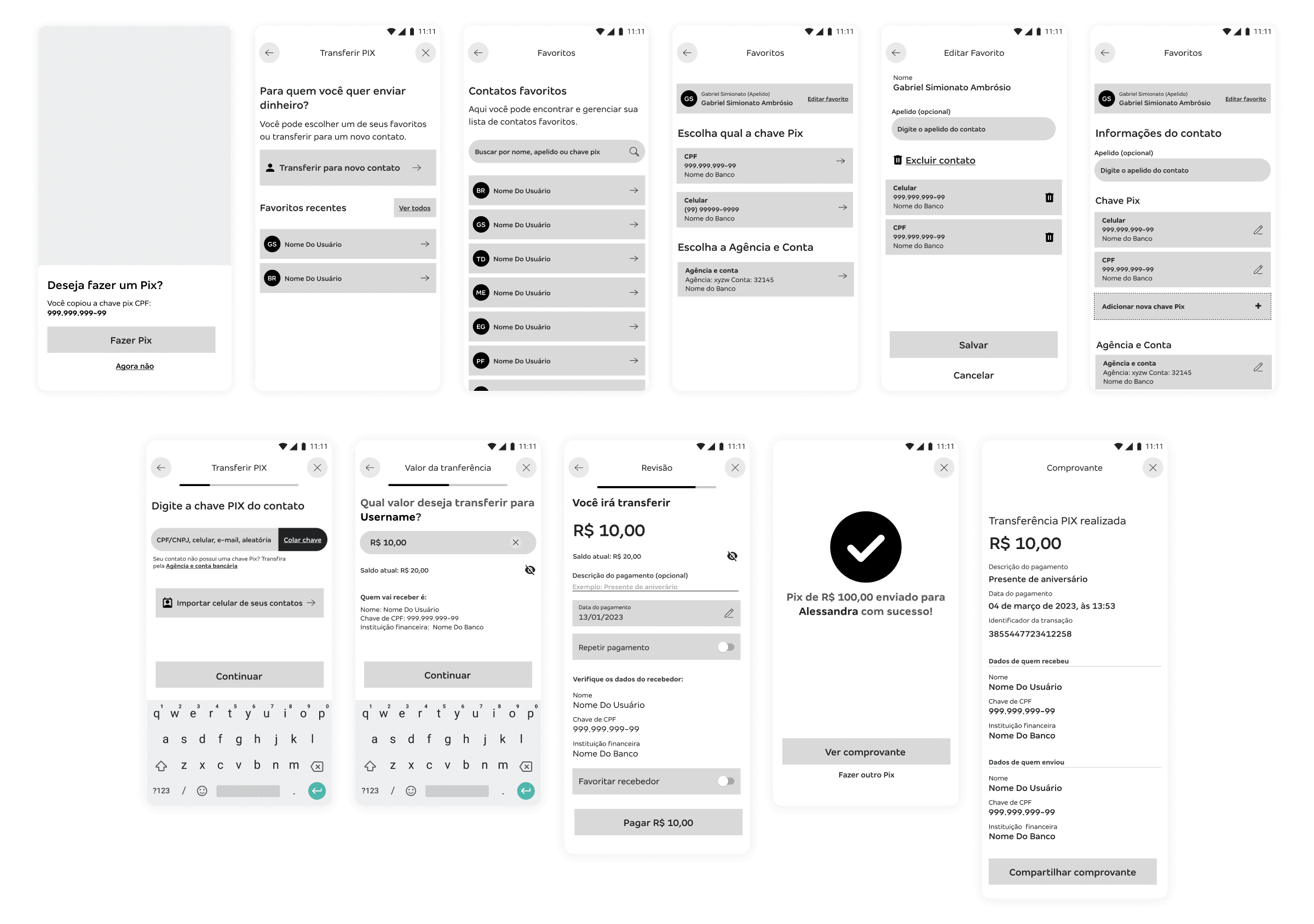
To expedite the exploration of potential solutions, I first focused on creating medium-fidelity prototypes for the previously prioritized features. As development progressed, I presented these solutions during design critique sessions with the team to gather feedback and facilitate an iterative process.

Para agilizar a exploração de possíveis soluções, primeiro foquei em desenvolver protótipos de média fidelidade das funcionalidades priorizadas anteriormente. Conforme avancei no desenvolvimento, rodadas de Design Critique foram efetuadas com o time para obter feedbacks e realizar um processo

Overcoming obstacles

A hurdle along the way...

The squad faced shifting priorities, meaning that developing new features requiring significant back-end effort was no longer a priority. Despite this constraint, it was still possible to implement numerous flow improvements based on our discovery findings.

Proposed solutions
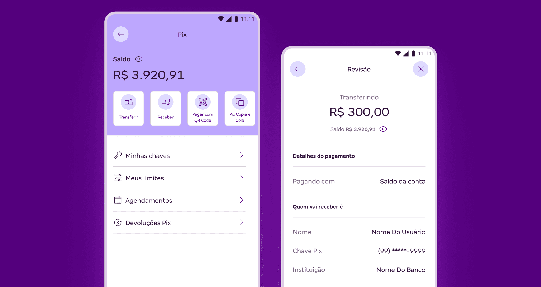
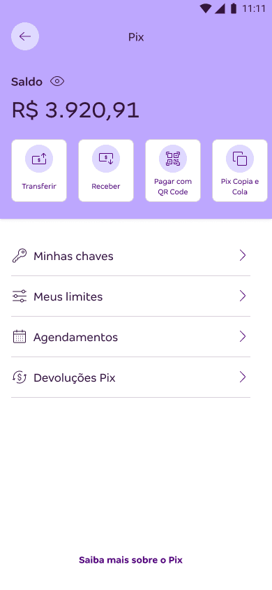
New Pix area

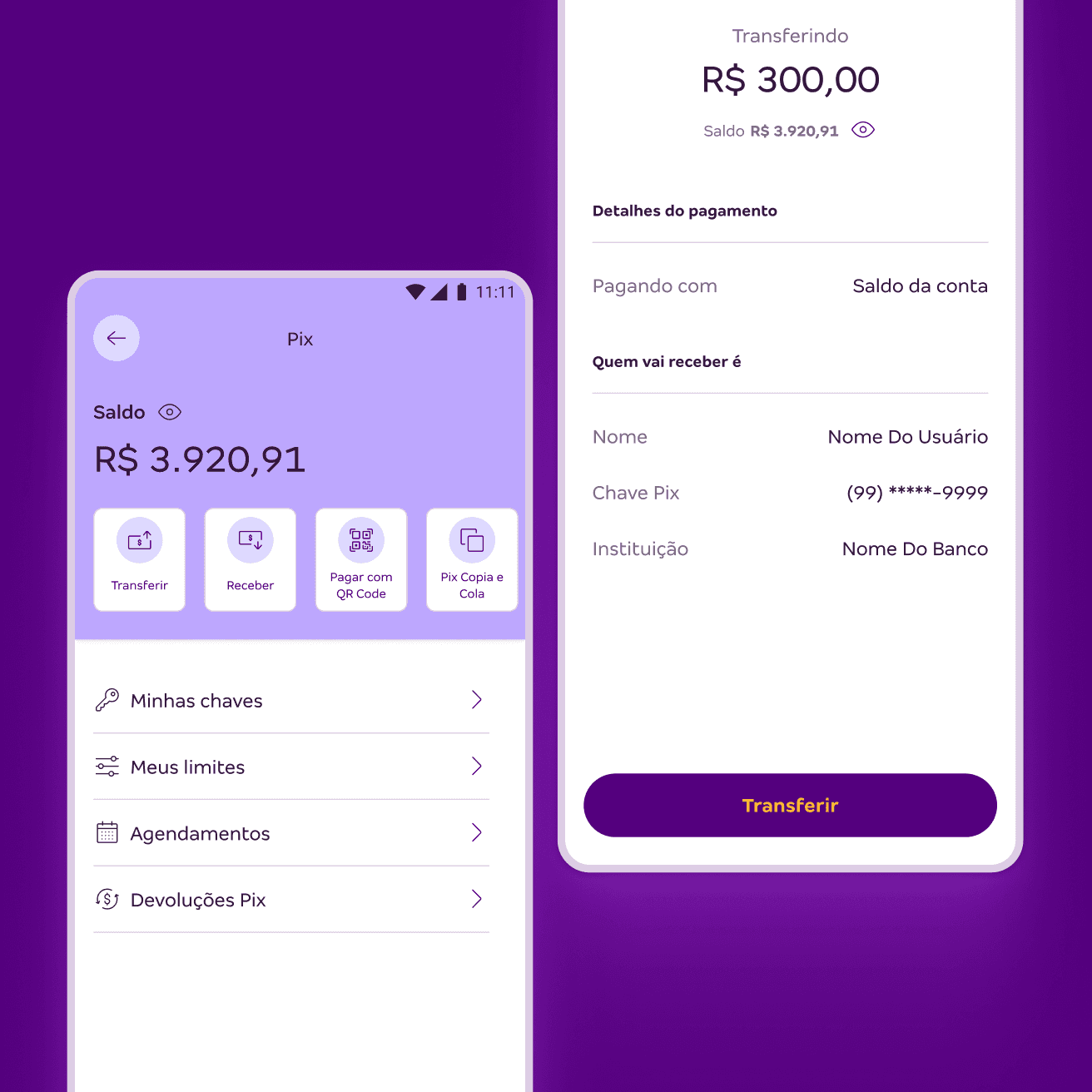
I utilized horizontal shortcuts for the most frequently used actions and a vertical list for management features.

Before
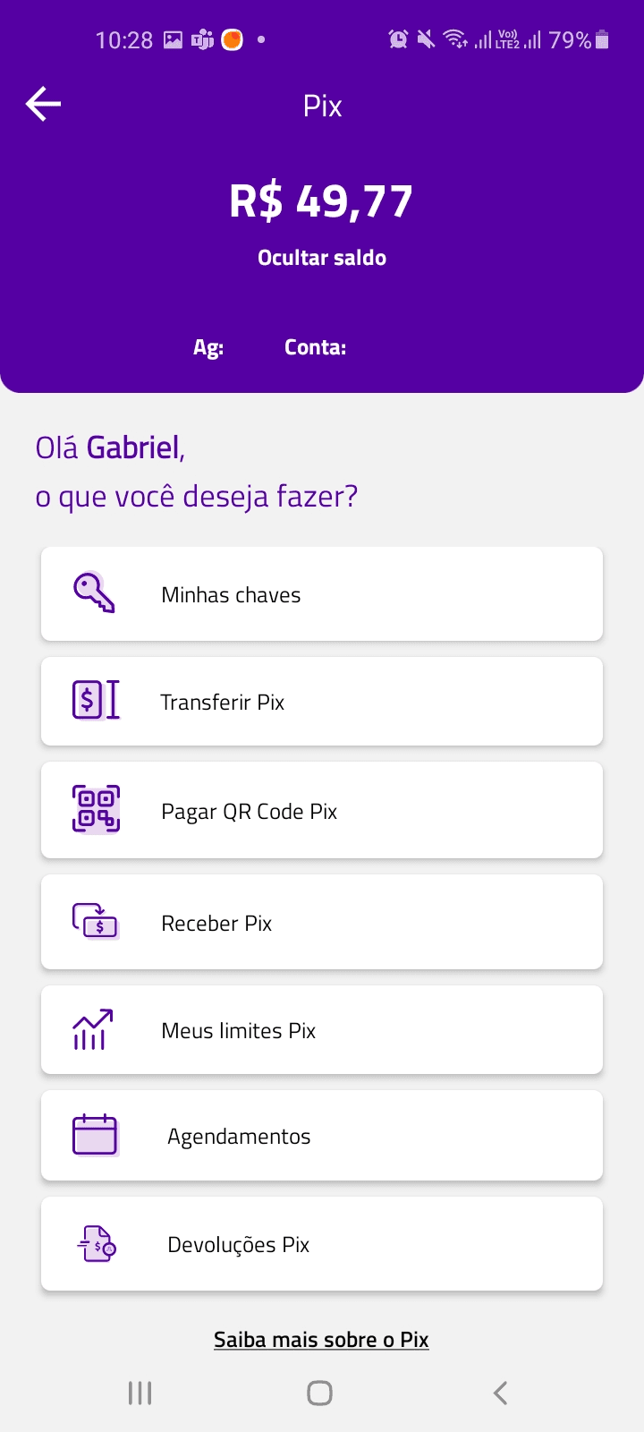
After
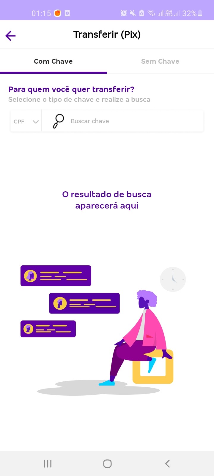
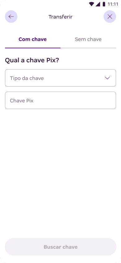
Initial transfer screen

Greater emphasis on the interface elements for data input and submission.

Before
After
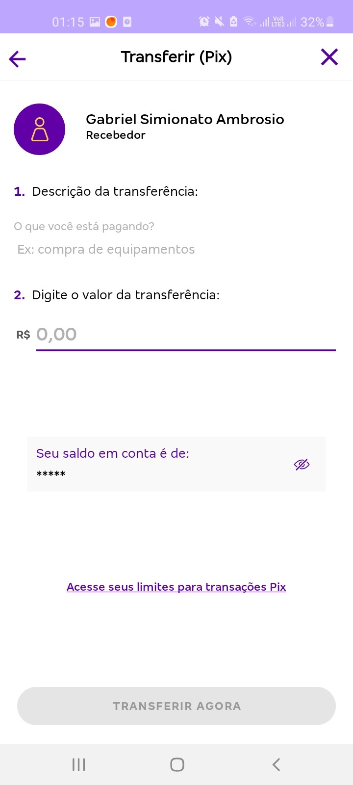
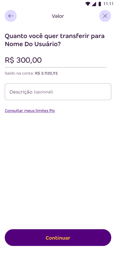
Entering payment amount

The amount input field now holds a more prominent position in the visual hierarchy, and I made it clear that the description is optional.

Additionally, the recipient's name is highlighted within the interface's instructional text.

Before
After
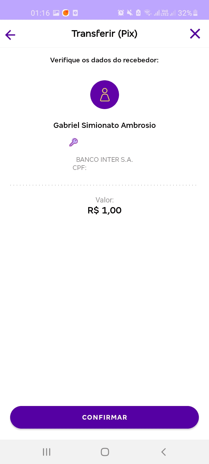
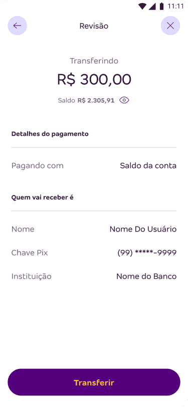
Confirming the transaction

The transfer amount now takes center stage, accompanied by account balance feedback displayed directly below it.

Payment and recipient details have been reorganized into a list format.

Before
After
Removing friction from the journey

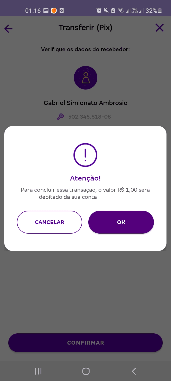
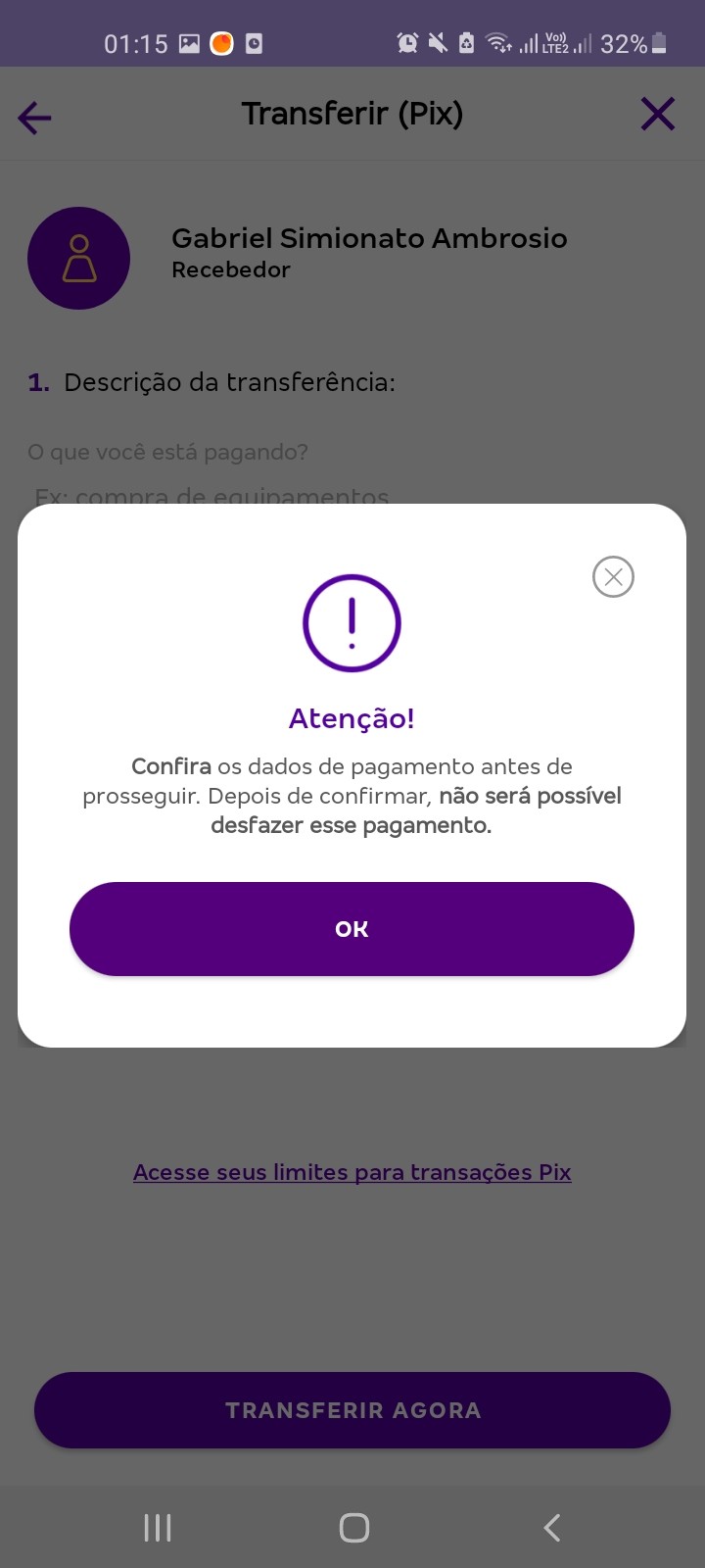
The legacy flow was created for the launch of Pix, amidst uncertainty regarding how it would work and how users would respond. As the payment method gained popularity, we were able to eliminate the modal windows that caused unwanted friction in the user experience by requesting excessive confirmations.

Before
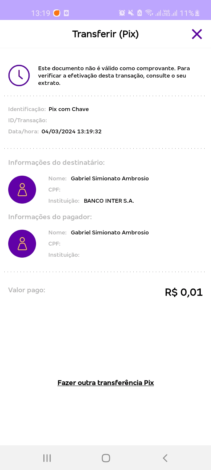
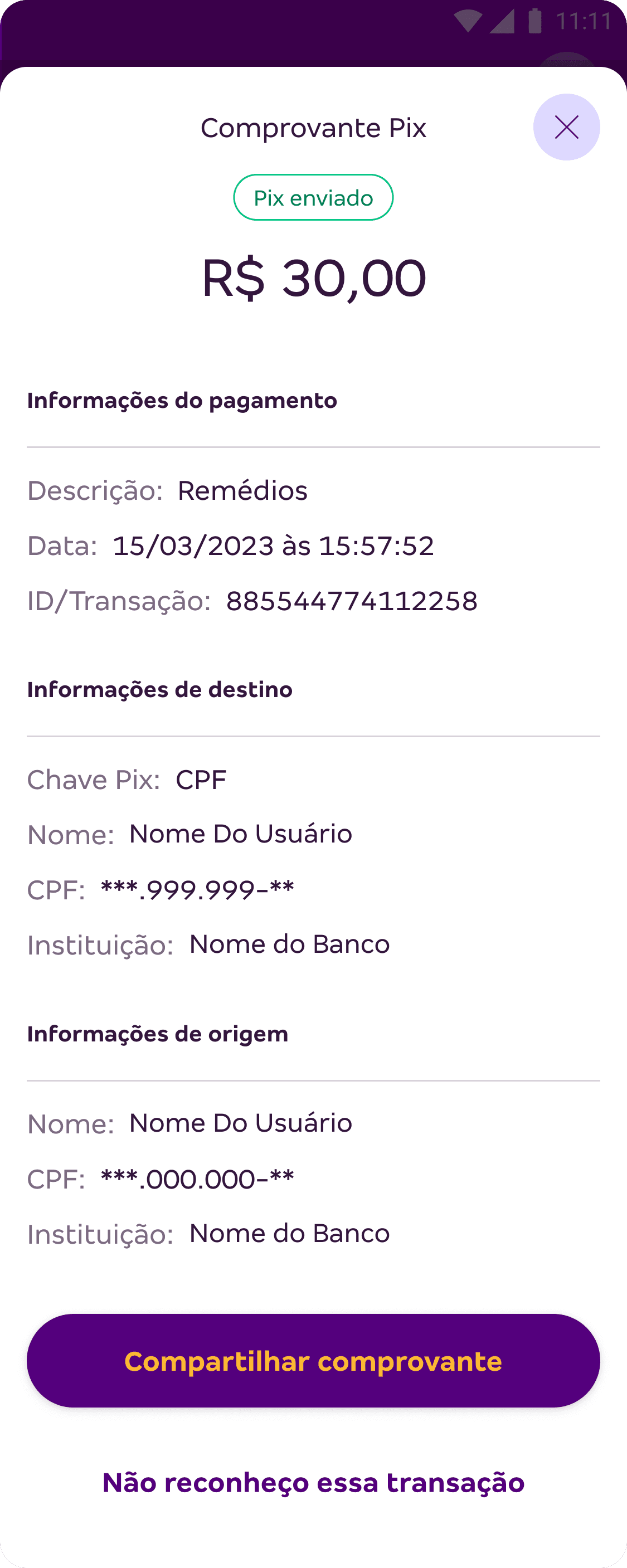
New transfer receipt

It is now possible to share the receipt immediately after the transaction.

We also prioritized a clear, concise view of the payment details.

Before
After
Communicating with our users

Push notifications are now in place to keep users updated in real-time about sending and receiving Pix transactions.

After

Defining success metrics

We didn't have dedicated analytics time to track the performance of the proposed changes. Even so, I defined—together with the squad—the indicators to monitor as signs of success over time:

Reduction in the average time to complete a Pix transfer.

Reduction in the average time to complete a Pix transfer.

Improvement in conversion rates throughout the journey funnel.

Improvement in conversion rates throughout the journey funnel.

Improvement in user satisfaction with the journey, reflected in ratings and qualitative feedback.

Results

Results

Impact achieved

Impact achieved

+1 flow using the Design System, moving us closer to full app-wide adoption.

+1 flow using the Design System, moving us closer to full app-wide adoption.

Compliance with all regulations outlined in the Central Bank manual.

Compliance with all regulations outlined in the Central Bank manual.

Resolution of usability issues identified during the Discovery phase.

Resolution of usability issues identified during the Discovery phase.

Key takeaways

What did I learn during this project?

Techniques drive results

Choosing techniques suited to our constraints was crucial, allowing us to achieve positive results even without direct user interaction.

Techniques drive results

Choosing techniques suited to our constraints was crucial, allowing us to achieve positive results even without direct user interaction.

The impact of a Design System

Using it brought agility and consistency to our deliverables, allowing us to focus on user needs. Creating the final design becomes like assembling Lego bricks.

The impact of a Design System

Using it brought agility and consistency to our deliverables, allowing us to focus on user needs. Creating the final design becomes like assembling Lego bricks.

Adapting communication is essential

Qualitative insights are invaluable, but quantitative data can be more effective for demonstrating results objectively.

Adapting communication is essential

Qualitative insights are invaluable, but quantitative data can be more effective for demonstrating results objectively.

Rapid adaptation is key

In a real-world work environment, we can always be affected by changes in direction, so it pays to be prepared to handle unexpected twists and turns.

Rapid adaptation is key

In a real-world work environment, we can always be affected by changes in direction, so it pays to be prepared to handle unexpected twists and turns.

Create a free website with Framer, the website builder loved by startups, designers and agencies.